Ещё четыре способа скрыть и показать элементы при помощи html и css
Содержание:
Блочные и строчные элементы
Большинство элементов в CSS классифицируются как блочные () или строчные (), и это влияет на то, как эти элементы будут отображаться по умолчанию на веб-странице.
Важно знать к какому типу относится элемент, так как не все CSS свойства работают с обоими типами элементов. Некоторые CSS свойства работают только с блочными элементами, другие только со строчными
CSS свойство display позволяет переопределить тип элемента, заданный по умолчанию. Что в свою очередь, позволят по необходимости изменять тип элемента со строчного на блочный или с блочного на строчный.
Строчные элементы
Элемент определённый как строчный, будет занимать только необходимое количество места на веб-странице (занимаемое место зависит от содержимого строчного элемента), кроме этого такие элементы:
- игнорируют верхний и нижний внешний отступ, если он применен
- игнорируют свойства height и width
- могут быть выровнены с помощью свойства vertical-align
Строчный элемент можно сделать блочным если установить для свойства значение или если сделать элемент плавающим. Плавающие элементы автоматически становятся блочными, то есть появляется возможность регулировать размер элемента и задавать внешние отступы.
Блочные элементы
Блочные элементы всегда начинаются с новой строки и занимают всю доступную ширину, если ширина для элемента не была установлена. Кроме этого блочные элементы:
- могут иметь внешние и внутренние отступы
- растягиваются по высоте под свое содержимое
- не выравниваются свойством vertical-align
Строчно-блочные элементы
Строчно-блочное отображение элемента задается значением . В основном это способ сделать элемент строчным, но сохранить его «блочные» возможности: изменение высоты и ширины элемента, регулирование размеров внешних и внутренних отступов.
<!DOCTYPE html>
<html>
  <head>
    <meta charset="utf-8">
    <title>Название документа</title>
    <style>
      p { display: inline; }
      span { display: block; }
	  li { display: inline-block; }
    </style>
  </head>
  <body>
    <p>Абзац 1.</p><p>абзац 2.</p>
    <span>Практическое применение свойства display мы рассмотрим</span>
    <span>в главе "CSS меню"</span>
	<ul>
	  <li>Пункт 1</li>
	  <li>Пункт 2</li>
	  <li>Пункт 3</li>
	</ul>
  </body>
</html>
Попробовать »
Примечание: значение не поддерживается в IE7 и более ранних версиях.
Check Hidden Element
Example
If the <div> element is hidden, do something:
function myFunction() { var x = document.getElementById(«myDIV»);
if (window.getComputedStyle(x).display === «none») { // Do something..
}}
Note: When an element is hidden with (like in the example above), the element will not take up any space.
To find out if an element is hidden with , see the example below. This «hidden» element will take up space.
Example
function myFunction() { var x = document.getElementById(«myDIV»);
if (window.getComputedStyle(x).visibility === «hidden») { // Do something..
}}
Tip: Also check out How To — Toggle Hide/Show.
Tip: For more information about Display and Visibility, read our CSS Display Tutorial.
❮ Previous
Next ❯
CSS Properties
align-contentalign-itemsalign-selfallanimationanimation-delayanimation-directionanimation-durationanimation-fill-modeanimation-iteration-countanimation-nameanimation-play-stateanimation-timing-functionbackface-visibilitybackgroundbackground-attachmentbackground-blend-modebackground-clipbackground-colorbackground-imagebackground-originbackground-positionbackground-repeatbackground-sizeborderborder-bottomborder-bottom-colorborder-bottom-left-radiusborder-bottom-right-radiusborder-bottom-styleborder-bottom-widthborder-collapseborder-colorborder-imageborder-image-outsetborder-image-repeatborder-image-sliceborder-image-sourceborder-image-widthborder-leftborder-left-colorborder-left-styleborder-left-widthborder-radiusborder-rightborder-right-colorborder-right-styleborder-right-widthborder-spacingborder-styleborder-topborder-top-colorborder-top-left-radiusborder-top-right-radiusborder-top-styleborder-top-widthborder-widthbottombox-decoration-breakbox-shadowbox-sizingbreak-afterbreak-beforebreak-insidecaption-sidecaret-color@charsetclearclipclip-pathcolorcolumn-countcolumn-fillcolumn-gapcolumn-rulecolumn-rule-colorcolumn-rule-stylecolumn-rule-widthcolumn-spancolumn-widthcolumnscontentcounter-incrementcounter-resetcursordirectiondisplayempty-cellsfilterflexflex-basisflex-directionflex-flowflex-growflex-shrinkflex-wrapfloatfont@font-facefont-familyfont-feature-settingsfont-kerningfont-sizefont-size-adjustfont-stretchfont-stylefont-variantfont-variant-capsfont-weightgridgrid-areagrid-auto-columnsgrid-auto-flowgrid-auto-rowsgrid-columngrid-column-endgrid-column-gapgrid-column-startgrid-gapgrid-rowgrid-row-endgrid-row-gapgrid-row-startgrid-templategrid-template-areasgrid-template-columnsgrid-template-rowshanging-punctuationheighthyphens@importisolationjustify-content@keyframesleftletter-spacingline-heightlist-stylelist-style-imagelist-style-positionlist-style-typemarginmargin-bottommargin-leftmargin-rightmargin-topmax-heightmax-width@mediamin-heightmin-widthmix-blend-modeobject-fitobject-positionopacityorderoutlineoutline-coloroutline-offsetoutline-styleoutline-widthoverflowoverflow-xoverflow-ypaddingpadding-bottompadding-leftpadding-rightpadding-toppage-break-afterpage-break-beforepage-break-insideperspectiveperspective-originpointer-eventspositionquotesresizerightscroll-behaviortab-sizetable-layouttext-aligntext-align-lasttext-decorationtext-decoration-colortext-decoration-linetext-decoration-styletext-indenttext-justifytext-overflowtext-shadowtext-transformtoptransformtransform-origintransform-styletransitiontransition-delaytransition-durationtransition-propertytransition-timing-functionunicode-bidiuser-selectvertical-alignvisibilitywhite-spacewidthword-breakword-spacingword-wrapwriting-modez-index
Initializers
Another common use case is when you need to execute some actions upon a switch to
particular visibility state.
Waiting until the page becomes visible
checks current state of the page. If it is
visible now, it will run , otherwise it will wait until state changes
to , and then run .
For example, let’s show an animated notification only when the page is visible,
so if some user opens a page in the background, the animation will delay until
the page becomes visible, i.e. until the user has switched
to a tab with the page:
Visibility.onVisible(function () {
    startIntroAnimation();
});
If a browser doesn’t support Page Visibility API,
will run the immediately.
Wait until the page is opened after prerendering
A web developer can hint a browser (using Prerendering API) that an user
is likely to click on some link (i.e. on a “Next” link in a multi-page article),
and the browser then may prefetch and prerender the page, so that the user will
not wait after actually going via the link.
But you may not want to count the browser prerendering a page as a visitor in
your analytics system. Moreover, the browser will disable prerendering if you
will try to do heavy computations or use audio/video tags on the page. So, you
may decide to not run parts of the code while prerendering and wait until the
user actually opens the link.
You can use in this cases. For example,
this code will only take real visitors (and not page prerenderings) into
account:
Visibility.afterPrerendering(function () {
    Statistics.countVisitor();
});
If the browser doesn’t support Page Visibility API,
will run immediately.
color Alpha Transparency
affects the whole element, but it’s also possible to set the , , and properties separately. Applying a zero alpha channel using or similar renders an item fully transparent:
See the Pen
hide with color alpha by SitePoint (@SitePoint)
on CodePen.
Each property can be animated separately to create interesting effects. Note that transparency can’t be applied to elements with image backgrounds unless they’re generated using or similar.
The alpha channel can be set with:
- : fully transparent (in-between animations are not possible)
- : red, green, blue, and alpha
- : hue, saturation, lightness, and alpha
- and
| metric | effect |
|---|---|
| browser support | good, but IE only supports and |
| accessibility | content still read |
| layout affected? | no |
| rendering required | painting |
| performance | good, but not as fast as |
| animation frames possible? | yes |
| events triggered when hidden? | yes |
Псевдоэлементы
Иногда с псевдоэлементами и можно поиграться, многие стилистические фичи основаны именно на этих двух псевдоэлементах, и пока они пустые (без контента), всё выглядит вполне сносно. Проблема с размещением контента в этих элементах заключается в том, что не все устройства способны справляться с нагрузкой. Так что не размещайте в них ничего.
Псевдоэлементы и не работают так, как вы могли предполагать. Они действуют лишь на первый символ/строку в блоке. С , бывает, возникает ошибка с двухбайтовыми символами, такими как Japanese Kana, и
С управлением стилями выделенного текста или placeholder’а, осуществляемого с помощью или , зачастую возникают проблемы. С всё просто: не используйте его
Это особенно важно для полей ввода паролей и т.п
При выделении текста и измении стиля (обычно и ) возникают коварные баги. Пока , не совместимые с браузерами и устройствами, недостаточно контрастны и не так сочетаются с цветом и стилем текста на вашем сайте, пользователи частенько переписывают их для лучшей читабельности. Изменение цветов в этом случае либо не будет работать, либо будет мешать их стилям (если вы пользовались ). Использование этого псевдоэлемента для красивой картинки может обернуться недовольством посетителей вашего сайта.
CSS Properties
align-contentalign-itemsalign-selfallanimationanimation-delayanimation-directionanimation-durationanimation-fill-modeanimation-iteration-countanimation-nameanimation-play-stateanimation-timing-functionbackface-visibilitybackgroundbackground-attachmentbackground-blend-modebackground-clipbackground-colorbackground-imagebackground-originbackground-positionbackground-repeatbackground-sizeborderborder-bottomborder-bottom-colorborder-bottom-left-radiusborder-bottom-right-radiusborder-bottom-styleborder-bottom-widthborder-collapseborder-colorborder-imageborder-image-outsetborder-image-repeatborder-image-sliceborder-image-sourceborder-image-widthborder-leftborder-left-colorborder-left-styleborder-left-widthborder-radiusborder-rightborder-right-colorborder-right-styleborder-right-widthborder-spacingborder-styleborder-topborder-top-colorborder-top-left-radiusborder-top-right-radiusborder-top-styleborder-top-widthborder-widthbottombox-decoration-breakbox-shadowbox-sizingbreak-afterbreak-beforebreak-insidecaption-sidecaret-color@charsetclearclipclip-pathcolorcolumn-countcolumn-fillcolumn-gapcolumn-rulecolumn-rule-colorcolumn-rule-stylecolumn-rule-widthcolumn-spancolumn-widthcolumnscontentcounter-incrementcounter-resetcursordirectiondisplayempty-cellsfilterflexflex-basisflex-directionflex-flowflex-growflex-shrinkflex-wrapfloatfont@font-facefont-familyfont-feature-settingsfont-kerningfont-sizefont-size-adjustfont-stretchfont-stylefont-variantfont-variant-capsfont-weightgridgrid-areagrid-auto-columnsgrid-auto-flowgrid-auto-rowsgrid-columngrid-column-endgrid-column-gapgrid-column-startgrid-gapgrid-rowgrid-row-endgrid-row-gapgrid-row-startgrid-templategrid-template-areasgrid-template-columnsgrid-template-rowshanging-punctuationheighthyphens@importisolationjustify-content@keyframesleftletter-spacingline-heightlist-stylelist-style-imagelist-style-positionlist-style-typemarginmargin-bottommargin-leftmargin-rightmargin-topmax-heightmax-width@mediamin-heightmin-widthmix-blend-modeobject-fitobject-positionopacityorderoutlineoutline-coloroutline-offsetoutline-styleoutline-widthoverflowoverflow-xoverflow-ypaddingpadding-bottompadding-leftpadding-rightpadding-toppage-break-afterpage-break-beforepage-break-insideperspectiveperspective-originpointer-eventspositionquotesresizerightscroll-behaviortab-sizetable-layouttext-aligntext-align-lasttext-decorationtext-decoration-colortext-decoration-linetext-decoration-styletext-indenttext-justifytext-overflowtext-shadowtext-transformtoptransformtransform-origintransform-styletransitiontransition-delaytransition-durationtransition-propertytransition-timing-functionunicode-bidiuser-selectvertical-alignvisibilitywhite-spacewidthword-breakword-spacingword-wrapwriting-modez-index
opacity and filter: opacity()
The and properties can be passed a number between 0 and 1, or a percentage between 0% and 100% denoting fully transparent and fully opaque accordingly.
See the Pen
hide with opacity: 0 by SitePoint (@SitePoint)
on CodePen.
There’s little practical difference between the two in modern browsers, although should be used if multiple effects are applied at the same time (blur, contrast, grayscale etc.)
Opacity can be animated and offers great performance, but be wary that a fully transparent element remains on the page and can trigger events.
| metric | effect |
|---|---|
| browser support | good, but IE only supports 0 to 1 |
| accessibility | content not read if 0 or 0% is set |
| layout affected? | no |
| rendering required | composition |
| performance | best, can use hardware acceleration |
| animation frames possible? | yes |
| events triggered when hidden? | yes |
CSS Tutorial
CSS HOMECSS IntroductionCSS SyntaxCSS SelectorsCSS How ToCSS CommentsCSS Colors
Colors
RGB
HEX
HSL
CSS Backgrounds
Background Color
Background Image
Background Repeat
Background Attachment
Background Shorthand
CSS Borders
Borders
Border Width
Border Color
Border Sides
Border Shorthand
Rounded Borders
CSS Margins
Margins
Margin Collapse
CSS PaddingCSS Height/WidthCSS Box ModelCSS Outline
Outline
Outline Width
Outline Color
Outline Shorthand
Outline Offset
CSS Text
Text Color
Text Alignment
Text Decoration
Text Transformation
Text Spacing
Text Shadow
CSS Fonts
Font Family
Font Web Safe
Font Style
Font Size
Font Google
Font Shorthand
CSS IconsCSS LinksCSS ListsCSS Tables
Table Borders
Table Size
Table Alignment
Table Style
Table Responsive
CSS DisplayCSS Max-widthCSS PositionCSS OverflowCSS Float
Float
Clear
Float Examples
CSS Inline-blockCSS AlignCSS CombinatorsCSS Pseudo-classCSS Pseudo-elementCSS OpacityCSS Navigation Bar
Navbar
Vertical Navbar
Horizontal Navbar
CSS DropdownsCSS Image GalleryCSS Image SpritesCSS Attr SelectorsCSS FormsCSS CountersCSS Website LayoutCSS UnitsCSS Specificity
Пример использования
<!DOCTYPE html>
<html>
<head>
<title>Отображение задней стороны элемента при трансформации в CSS</title>
<style>
div {
display : inline-block; /* устанавливаем элементы <div> как блочно-строчные (выстраиваем в линейку) */
width : 200px; /* устанавливаем ширину блока */
height : 200px; /* устанавливаем высоту блока */
margin : 50px; /* устанавливаем величину внешнего отступа для всех сторон элемента */
font-size: 32px;  /* устанавливаем размер шрифта */
text-align: center;  /* выравниваем текст по центру */
line-height: 200px;  /* для выравнивания текста по вертикали устанавливаем междустрочный интервал равным высоте элемента */
}

@-webkit-keyframes iliketomoveit { /* для поддержки ранних версий браузеров */
		100% {
			-moz-transform : rotateY(360deg);  /* для поддержки ранних версий браузеров */
			-webkit-transform : rotateY(360deg); /* для поддержки ранних версий браузеров */
			-ms-transform : rotateY(360deg); /* для поддержки ранних версий браузеров */
			transform : rotateY(360deg); /* двухмерное преобразование путем поворота элемента по часовой стрелке на 360 градусов */
			}
	}
@keyframes iliketomoveit {
		100% {
			-moz-transform : rotateY(360deg); /* для поддержки ранних версий браузеров */
			-webkit-transform : rotateY(360deg); /* для поддержки ранних версий браузеров */
			-ms-transform : rotateY(360deg); /* для поддержки ранних версий браузеров */
			transform : rotateY(360deg);/* двухмерное преобразование путем поворота элемента по часовой стрелке на 360 градусов */
			}
}
.test {
-webkit-animation : iliketomoveit 5s linear infinite; /* для поддержки ранних версий браузеров */
animation : iliketomoveit 5s linear infinite; /* имя анимации, указанное в ключевом кадре, длительность анимации, с одинаковой скоростью, бесконечно */
background : green;  /* устанавливаем цвет заднего фона */
-webkit-backface-visibility : visible; /* для поддержки ранних версий браузеров */
-moz-backface-visibility : visible; /* для поддержки ранних версий браузеров */
backface-visibility : visible; /* задняя сторона элемента видна (отображается) - это значение по умолчанию */
}
.test2 {
-webkit-animation : iliketomoveit 5s linear infinite; /* для поддержки ранних версий браузеров */
animation : iliketomoveit 5s linear infinite; /* имя анимации, указанное в ключевом кадре, длительность анимации, с одинаковой скоростью, бесконечно */
background : orange;  /* устанавливаем цвет заднего фона */
-webkit-backface-visibility : hidden; /* для поддержки ранних версий браузеров */
-moz-backface-visibility : hidden; /* для поддержки ранних версий браузеров */
backface-visibility : hidden; /* задняя сторона элемента скрыта (не отображается) */
}
</style>
</head>
	<body>
		<div class = "test">
			VISIBLE
		</div>
		<div class = "test2">
			HIDDEN
		</div>
	</body>
</html>
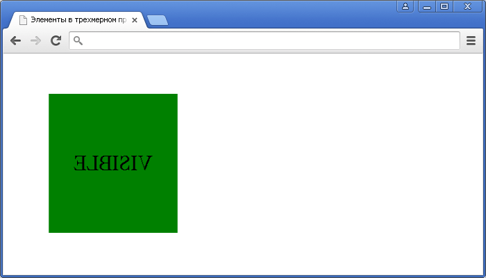
Пример использования CSS свойства backface-visibility(отображение задней стороны элемента при трансформации в CSS).CSS свойства
display
is probably the most-used element-hiding method. A value of effectively removes the element as if it never existed in the DOM.
See the Pen
hide with display: none by SitePoint (@SitePoint)
on CodePen.
However, it’s possibly the worst CSS property to use in the majority of cases. It can’t be animated and will trigger a page layout unless the element is moved out of the document flow using or the new property is adopted.
is also overloaded, with options such as , , , , and more. Resetting back to the correct value after can be problematic (although may help).
| metric | effect |
|---|---|
| browser support | excellent |
| accessibility | content not read |
| layout affected? | yes |
| rendering required | layout |
| performance | poor |
| animation frames possible? | no |
| events triggered when hidden? | no |
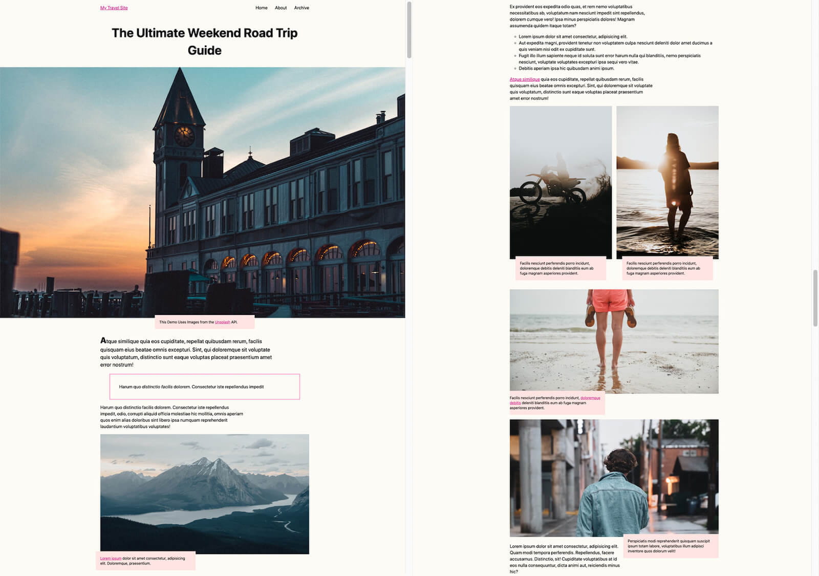
Пример: блог о путешествиях #
В этом примере мы базируем наш блог о путешествиях справа и применяем его к фрагментированным областям слева. Результаты показывают, что время рендеринга увеличивается с 232 мс до 30 мс при начальной загрузке страницы.
Блог о путешествиях обычно содержит набор историй с несколькими изображениями и некоторым описательным текстом. Вот что происходит в обычном браузере при переходе на блог о путешествиях:
- Часть страницы загружается из сети вместе со всеми необходимыми ресурсами.
- Браузер стилизует и размещает все содержимое страницы, не учитывая, является ли содержимое видимым для пользователя.
- Браузер возвращается к шагу 1, пока не будут загружены все страницы и ресурсы.
На шаге 2 браузер обрабатывает все содержимое в поисках вещей, которые могли измениться. Он обновляет стиль и макет любых новых элементов, а также элементов, которые могли сместиться в результате новых обновлений. Это работа по рендерингу. На это нужно время.
 Пример туристического блога. См. Демонстрацию на Codepen
Теперь подумайте, что произойдет, если вы разместите каждую из историй в блоге. Общий цикл тот же: браузер загружает и отображает фрагменты страницы. Однако разница заключается в объеме работы, выполняемой на шаге 2.
Благодаря видимости содержимого он будет стилизовать и разметить все содержимое, которое в настоящее время отображается пользователю (оно отображается на экране). Однако при обработке истории, которая полностью находится за пределами экрана, браузер пропустит работу по рендерингу и только создаст стиль и макет самого блока элемента.
Производительность загрузки этой страницы будет такой, как если бы она содержала полные экранные истории и пустые поля для каждой из закадровых историй. Это работает намного лучше, с ожидаемым снижением затрат на визуализацию загрузки на 50% или более . В нашем примере мы видим увеличение времени рендеринга с 232 мс до 30 мс . Это 7-кратный прирост производительности.
Какую работу нужно проделать, чтобы воспользоваться этими преимуществами? Сначала мы разбиваем контент на разделы:
 Пример разделения содержимого на разделы с применением класса для получения . См. Демонстрацию на Codepen
Затем мы применяем к разделам следующее правило стиля:
Обратите внимание, что по мере того, как контент перемещается в область видимости и исчезает, он будет запускаться и прекращать отображение по мере необходимости. Однако это не означает, что браузеру придется отображать и повторно отображать один и тот же контент снова и снова, поскольку работа по визуализации сохраняется, когда это возможно
Указание естественного размера элемента с помощью #
Чтобы реализовать потенциальные преимущества , браузеру необходимо применить ограничение размера, чтобы гарантировать, что результаты рендеринга содержимого никоим образом не влияют на размер элемента. Это означает, что элемент будет выложен так, как если бы он был пустым. Если элемент не имеет высоты, указанной в обычном макете блока, то он будет иметь нулевую высоту.
Это может быть не идеально, так как размер полосы прокрутки будет смещаться в зависимости от того, что каждая история имеет ненулевую высоту.
К счастью, CSS предоставляет другое свойство, которое эффективно определяет естественный размер элемента, если на элемент влияет ограничение размера . В нашем примере мы устанавливаем его как оценку высоты и ширины секций.
Это означает, что он будет располагаться так, как если бы у него был единственный дочерний элемент с размерами «внутреннего размера», гарантируя, что ваши блоки без размера по-прежнему занимают место. действует как размер заполнителя вместо отображаемого содержимого.
Сброс стилей
Хорошо использовать немного улучшенную версию Meyers reset. Несколько аспектов удалены из reset’а, например списки иконок и элементов, которые могут привести к тому, что начнут объединяться вещи одинаковые по представлению, но разные по происхождению. Также в этой версии отсутствует установка в на 1, ведь всё зависит от шрифта и впоследствии могут возникнуть непредвиденные ошибки. В этом reset’е есть вещи, упомянутые выше. В CSS не добавляется атомарный класс , потому что есть лучшее решение, которое будет работать, даже если CSS не подгрузится, — hidden-атрибут. Обычно на скрытые элементы браузер выставляет , но это тоже можно изменить.
Исходники reset’a — https://github.com/NickGard/css-utils/blob/master/reset.css.
Ещё одна полезная штука — это класс . Вместе с для невидимого читаемого с экрана текста нужно использовать следующий блок кода:
Селекторы
Вместо , и универсальных селекторов (с ними всё сложно) используйте классы и селекторы классов. В случае с CSS, id-селектор будет лучше любого другого селектора, но id-селекторы должны быть уникальными на каждой странице, так что они не подходят для внедрения одних стилей сразу для нескольких элементов.
Производительность CSS-селекторов в современных браузерах — вопрос не первой важности, возможно, вы слышали об универсальном селекторе (*). О чём действительно стоит беспокоиться, так это о слишком большом охвате этого селектора
В будущем это может повлечь больше неудобств, чем пользы. Использование селектора вроде в конечном счёте потребует от вас выбрать какой-нибудь дочерний класс, так что вам придётся добавлять другие классы и направлять этот селектор на них.
Тот же самый аргумент можно привести в пользу неиспользования type-селекторов (, ), которые скапливаются в больших количествах и требуют добавления некоторых идентифицирующих свойств . Вот такие множественные селекторы более специфичны, и вероятность багов меньше.
То же самое с селекторами , и .
Example: a travel blog #
In this example, we baseline our travel blog on the right, and apply to chunked areas on the left. The results show rendering times going from 232ms to 30ms on initial page load.
A travel blog typically contains a set of stories with a few pictures, and some
descriptive text. Here is what happens in a typical browser when it navigates to
a travel blog:
- A part of the page is downloaded from the network, along with any needed
resources. - The browser styles and lays out all of the contents of the page, without
considering if the content is visible to the user. - The browser goes back to step 1 until all of the page and resources are
downloaded.
In step 2, the browser processes all of the contents looking for things that may
have changed. It updates the style and layout of any new elements, along with
the elements that may have shifted as a result of new updates. This is rendering
work. This takes time.
An example of a travel blog. See Demo on Codepen
Now consider what happens if you put on each of the
individual stories in the blog. The general loop is the same: the browser
downloads and renders chunks of the page. However, the difference is in the
amount of work that it does in step 2.
With content-visibility, it will style and layout all of the contents that are
currently visible to the user (they are on-screen). However, when processing the
story that is fully off-screen, the browser will skip the rendering work and
only style and layout the element box itself.
The performance of loading this page would be as if it contained full on-screen
stories and empty boxes for each of the off-screen stories. This performs much
better, with expected reduction of 50% or more from the rendering cost of
loading. In our example, we see a boost from a 232ms rendering time to a
30ms rendering time. That’s a 7x performance boost.
What is the work that you need to do in order to reap these benefits? First, we
chunk the content into sections:

Example of chunking content into sections with the class applied, to receive . See Demo on Codepen
Then, we apply the following style rule to the sections:
Note that as content moves in and out of visibility, it will start
and stop being rendered as needed. However, this does not mean that the browser
will have to render and re-render the same content over and over again, since
the rendering work is saved when possible.
Specifying the natural size of an element with
In order to realize the potential benefits of , the browser
needs to apply size containment to ensure that the rendering results of contents
do not affect the size of the element in any way. This means that the element
will lay out as if it was empty. If the element does not have a height specified
in a regular block layout, then it will be of 0 height.
This might not be ideal, since the size of the scrollbar will shift, being
reliant on each story having a non-zero height.
Thankfully, CSS provides another property, , which
effectively specifies the natural size of the element if the element is
affected by size containment. In our example, we are setting it to as
an estimate for the height and width of the sections.
This means it will lay out as if it had a single child of «intrinsic-size»
dimensions, ensuring that your unsized divs still occupy space.
acts as a placeholder size in lieu of rendered content.


